An Introduction to Pantone Color Matching System (PMS)
Perhaps you see a dark red, such as crimson, or a bright red, such as a stop sign. Simply mentioning "red" isn't enough in the printing industry. Even within tints and hues, there are minor variances, which leads us to the Pantone Matching System (PMS) - a global "language" for understanding and matching colors.
The Pantone Matching System's History:
Pantone was a commercial printing firm founded in the 1950s by two brothers, both of whom worked in advertising. A few years after the company's inception, the brothers employed Lawrence Herbert, a fresh college graduate who utilized his chemical skills to organize and arrange the company's collection of printing inks and pigments. Assume you have a product. Your logo will be printed by one printing business in one location, while your bespoke packaging will be manufactured by another printing company across the nation.
How can you be certain that both printers will utilize the same hues and colors in your logo and packaging to generate identical versions?
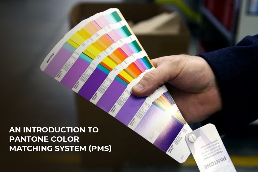
The Pantone Matching System (PMS) is how it is done. Pantone set out to develop a method that would allow for consistent color numbering, as there is frequently variance in printed colors when utilizing CMYK. Entire sheets in the PMS might be devoted to a single hue in a variety of subtle tints and variants. Several of these sheets can be joined together to form a "fan." They are number-coded and allow print designers to standardize their printing and match colors properly, no matter where they are.
Pantone's Two Matching Systems:
Pantone offers two matching systems: one for package design and another for product design. Pantone hues number over 5,000 in total. The color system is divided in this fashion to allow for what Pantone refers to as "market-relevant hues." Product design, for example, may utilize different shades of black, white, or neutral hues, but retail packaging may require colors that stand out on shelves and catch buyers' attention.
Furthermore, the appearance of a color is affected by the substance on which it is printed. Depending on the material, certain colors do not show up at all, while others appear horrendous and are not at all what a product developer would desire. That is why Pantone opted to break its PMS into two separate systems, so that print and graphic designers could know not only which colors could be reproduced on certain materials, but also that they would print well.
Also Read: What Aqueous Coating For Printing And Packaging Actually Is?
Also Read: What Aqueous Coating For Printing And Packaging Actually Is?
Palettes for the Pantone Matching System (PMS):
There may be a PMS palette to match depending on what you'll be printing on. There is a Pantone solid palette, a process palette, a textile palette, and a plastic palette, for example. Consider what you will be printing on to determine which colors you may use and which you should avoid. Using a PMS has a lot of advantages. Most crucially, because it is the world's most extensively used color matching system, you can take your printed material almost anywhere for replication, and printers can easily match those colors to their Pantone color code - assuring consistent results.
Furthermore, the PMS has a wide color gamut. Although there are other systems available, they fail to be as accurate and precise as the Pantone system. Pantone's method is so popular that a new color is chosen to symbolize each year. With names like "Tangerine Tango" and "Mimosa," they seem like flavored drinks rather than hues. But, when you think about it, they are like cocktails - diverse concoctions that serve as tastes for your eyes.
What's the Distinction Between PMS and CMYK?
To grasp the distinction between PMS and CMYK, it is necessary to first comprehend the distinction between spot color and process color. A logo is a good example of anything that makes use of spot colors. The characteristic brilliant yellow of McDonald's Golden Arches, for example, is a precise Pantone color name or number that can be matched on a printing machine. CMYK colors, on the other hand, are made by combining Cyan, Magenta, Yellow, and Black. Because of variations in printing machines and a variety of other reasons, one cyan, for example, may not match another, resulting in significant color discrepancies. Depending on the printer, the skill of the press operator, and a variety of other factors, that characteristic yellow, for example, may appear washed out or even unclean. Whether your printer uses digital printing or offsets printing will also influence how your printed colors seem. CMYK colors are not guaranteed to be consistent between printers or even print jobs, but Pantone colors are since they may be chosen based on a specific and internationally recognized name or color code.
Is it possible to convert Pantone to CMYK? Is it possible to convert from CMYK to Pantone?
This is possible, but it will be difficult. Graphic designers understand that the two systems are vastly different, and that complete, identical matches do not usually occur. Having said that, printing with Pantone inks may be costly, and it's usual for businesses to use CMYK to assist them to save money even if their logo color changes somewhat. At the same time, Pantone has nearly perfected assigning unique codes to the whole visible color spectrum, so a firm that wants to invest in the best and assure premium output at every level of the process may wish to transition from the CMYK four-color process to Pantone. Pantone provides conversion guidelines that will help you find the greatest possible match for your colors if you want to convert from Pantone to CMYK or vice versa. You may simply open the color swatch in a graphic design application like Adobe Photoshop or Adobe Illustrator and transform the colors.
Have a Question About Using the PMS?
Packaging customization is one of the most important aspects of packaging. PMS appears to be a basic system, yet its influence on the industry is significant. Working with the PMS ensures the finest quality color and precise color matching, allowing you to transfer your design from material to material with consistency. We realize, however, that you may still have questions regarding dealing with the Pantone Matching System, converting CMYK to PMS, and so on. Fortunately, we specialize in product package design in both CMYK and PMS. We offer the knowledge, experience, and skills to assist lead you from concept to completion, whether you have a small print project or want to scale your printing to fit a range of styles. Our expert packaging designers, printers, and graphic artists can collaborate with you every step of the way to create and print a design that far surpasses your expectations. We urge you to get in touch with us right away to learn more about how we can use the PMS to help bring your product to life with beautiful packaging that is both inexpensive and exceptional in every aspect.