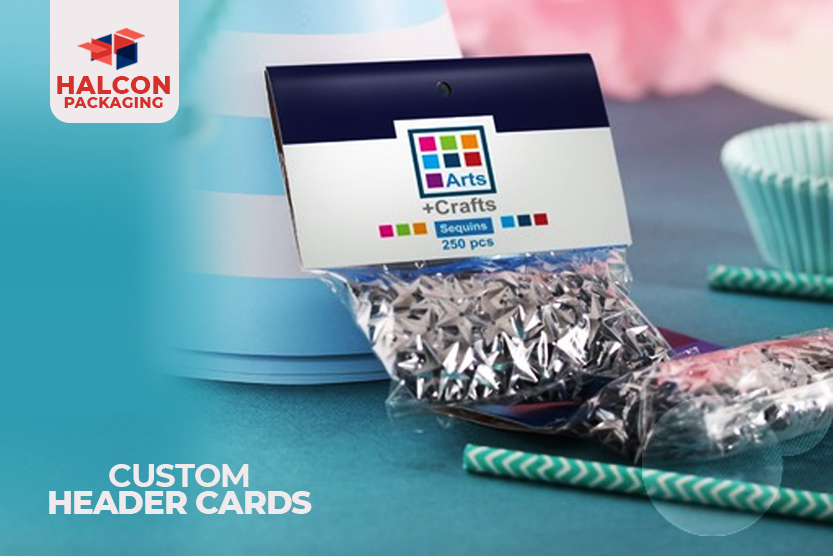
What Are The Effective Guidelines for Creating Custom Header Cards?
Nowadays, the consumer market is so crowded that consumers have little time to delve into the finer points of each product. Brands employ appealing header cards to catch a shopper's eye. One of the simplest and most efficient ways to package your product is with header cards (also known as bag toppers). The idea is to produce an appealing and intriguing header card headline that draws the shopper's attention. The majority of the time, you will receive header cards and other promotional products that just have the company's name on top of them. Although some people will know the name, this does not guarantee that the information supplied will be retained in their minds. It may even have the reverse effect in some cases!
By presenting the title in a variety of ways, you can build eye-catching header cards. The material on the header card, on the other hand, must provide a relevant message that piques the reader's interest. Here are some helpful tips to bear in mind when creating a header card.
Use Simple and Effective Titles:
Make use of language that will pique the buyer's curiosity. It's also an excellent way to establish a connection between the consumer and the item you're selling. People like to look for something different, therefore come up with something new to give.
Develop A Storyline For Your Title:
The next step is to double-check that your design expands on and clarifies what you expressed in your title. If you succeed in doing so, the initial curiosity will become more important. Because the first thing a customer will see while searching for the product they want to buy is a header with an effective title, it's important to take the time to build and design headers with an effective title.
Add A Custom Header That Illustrates Your Brand:
What kind of impression do you want your card to make on those who read it? Do you want them to believe you're innovative and creative? Do you want them to believe you're trustworthy and capable? All of this information can be presented to buyers via the header card. When selecting an image for your header card design, use one that is not overly saturated. Too much stuff can divert your customer's attention away from your key point.
Also Read: Which Things Attract Kids In Halloween Custom Packaging Boxes?
Also Read: Which Things Attract Kids In Halloween Custom Packaging Boxes?
Print Your Brand Logo:
It may appear that creating a logo is a difficult undertaking. It does, however, pay off. Your brand's logo does not have to be intricate. It might be as basic as writing your name in a certain font or combining your initial with a symbol or Customized design. Use icons to illustrate certain information such as your skills or passions and your experience. Icons are simplified vector graphics that convey concepts. They're perfect for injecting some personality into your header. It aids in the design and display of your header card. Icons can be used in a variety of ways to improve your design, including:
It may appear that creating a logo is a difficult undertaking. It does, however, pay off. Your brand's logo does not have to be intricate. It might be as basic as writing your name in a certain font or combining your initial with a symbol or Customized design. Use icons to illustrate certain information such as your skills or passions and your experience. Icons are simplified vector graphics that convey concepts. They're perfect for injecting some personality into your header. It aids in the design and display of your header card. Icons can be used in a variety of ways to improve your design, including:
- Pay close attention to the title.
- Make a logo or images that are unique to you.
- Make the most important points stand out.
- In lists, bullets should be replaced.
Highlight Your Contact Information:
A footnote can help you complete your header card with an impressive note, while a bright, bold heading can help you capture the readers' attention. A bold footer can also be used to draw attention to important information, such as your availability and contact information.
Add Signature:
You may have noticed that many of the cards have one thing in common at this point: they all have a signature. Although it is not needed, including a signature can give your brand a more personal touch.
