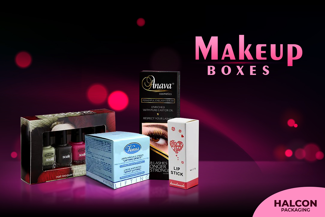
What Is The Reason Behind Custom Makeup Boxes?
Do you want to make the most beautiful personalized makeup boxes and packaging? The best place to begin is with the design. You should establish the design criteria for your company. Setting your design aspects for your brand's packaging first, however, is a preferable approach.
To get you started, think about the following:
Style:
So, you are considering the packaging for your goods. So, here is how you should go about getting started. First and foremost, you must give your package a personality and a mood. What should be done and how should it be done? What will the experience be like? When it comes to your design, are you considering a minimalist approach? Or perhaps you are thinking of the more stylized and extravagant designs?
Consider the bespoke box design and package design that you want to pursue. This will help you lead the rest of the design while also ensuring that your packaging decisions are by the design's overall goals.
Once you have decided on a style, it will be much easier to figure out what other design components you need or need to think about. Is it going to have a pop art feel to it? If so, some illustration will almost certainly be required to guide the entire design process. Alternatively, given your makeup brand is also called Natural, consider including some natural aspects. If that is the case, you can incorporate some natural imagery into your packaging design. The direction we are attempting to go with this is that the type of style you are looking for will aid you in incorporating all of those design components to get that style and feel across the makeup packaging boxes.
Colors:
These are the things you should consider while choosing colors for your packaging:
- Choosing a hue that is complementary to your brand's personality.
- Choosing a hue that will immediately catch your clients' attention.
- Choosing a color that makes your product stand out amid the severe competition.
But the point at which we are currently is the most crucial since we are dealing with the world's most fiercely competitive business – cosmetics and beauty!
You must choose your brand's color palette in the same way that you would construct the eye shadow palette that you believe you must have this season. In the end, we are asking you to be true to your brand while still striving to set yourself out from the competitors.
Let's say it is like this. Pink is a popular color in the world of beauty and cosmetics. The color is lighthearted and feminine. But the essential point is that it is one of those colors that is extensively employed in the glitzy world of cosmetics. We also use this hue a lot on our faces.
But here is the thing: there is a catch. Choosing pink simply because it is popular will not make things more difficult for you. In other words, you could be committing a major blunder. How are you going to do it? So, let's go right to the point. You select pink packages to be heaped in a makeup store that is already awash in pink. What are your chances of being noticed? Are you capable of capturing your customer's attention?
If you look at the most well-known cosmetics and beauty brands, you will discover that colors are an excellent strategy to promote their business. When I think of purple, for example, I immediately think of Urban Decay. Makeup has always had a thing for white and dramatic black.
So you want your business to succeed as well? All you have to do is follow in the footsteps of these brands. Find a color palette for your business that will not only help your products stand out on the shelves but will also become instantly associated with your brand.
Also Read: Why Packaging With Logo Is Essential For Cosmetic Product Brands?
Also Read: Why Packaging With Logo Is Essential For Cosmetic Product Brands?
Fonts:
Fonts are the next step. When it comes to colors, you want something different, something distinct from the competition. The idea is to be instantly identified by your customers when they glance at your package. Furthermore, the colors you chose will easily cause you to come to a halt as shoppers search the shelves stacked with the merchandise. But, in all likelihood, the fonts are not the same. It is a big mistake to use typefaces that are not readable.
We understand if you prefer a more traditional look. However, following the cliché is not a good idea. Stick to something simple, readable, and memorable. Let's use Clinique as an example. It employs an attractive Serif typeface that is both classic and timeless. They stand out and are easily read.
However, this does not imply that you must use the same typeface for your brand. Consider your package and how the typeface would appear on it. Then pick a typeface. You should start by checking and shortlisting all of the typefaces that work nicely with the package. But, at the end of the day, the fonts you choose should be simple to read and understand. You can readily read what is written on your custom printed packaging, even in their teeny-tiny form.